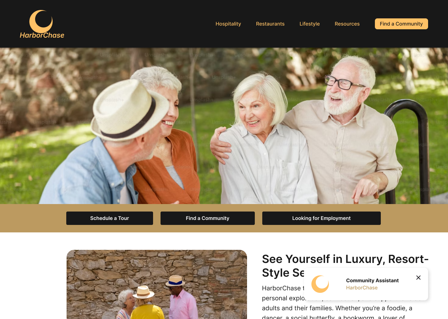
HRA: Celebrating
Senior Living.
Redesigning for the Silver Economy requires a balance between premium aesthetics and extreme usability. I focused on reducing "search fatigue" by implementing a predictive discovery engine.
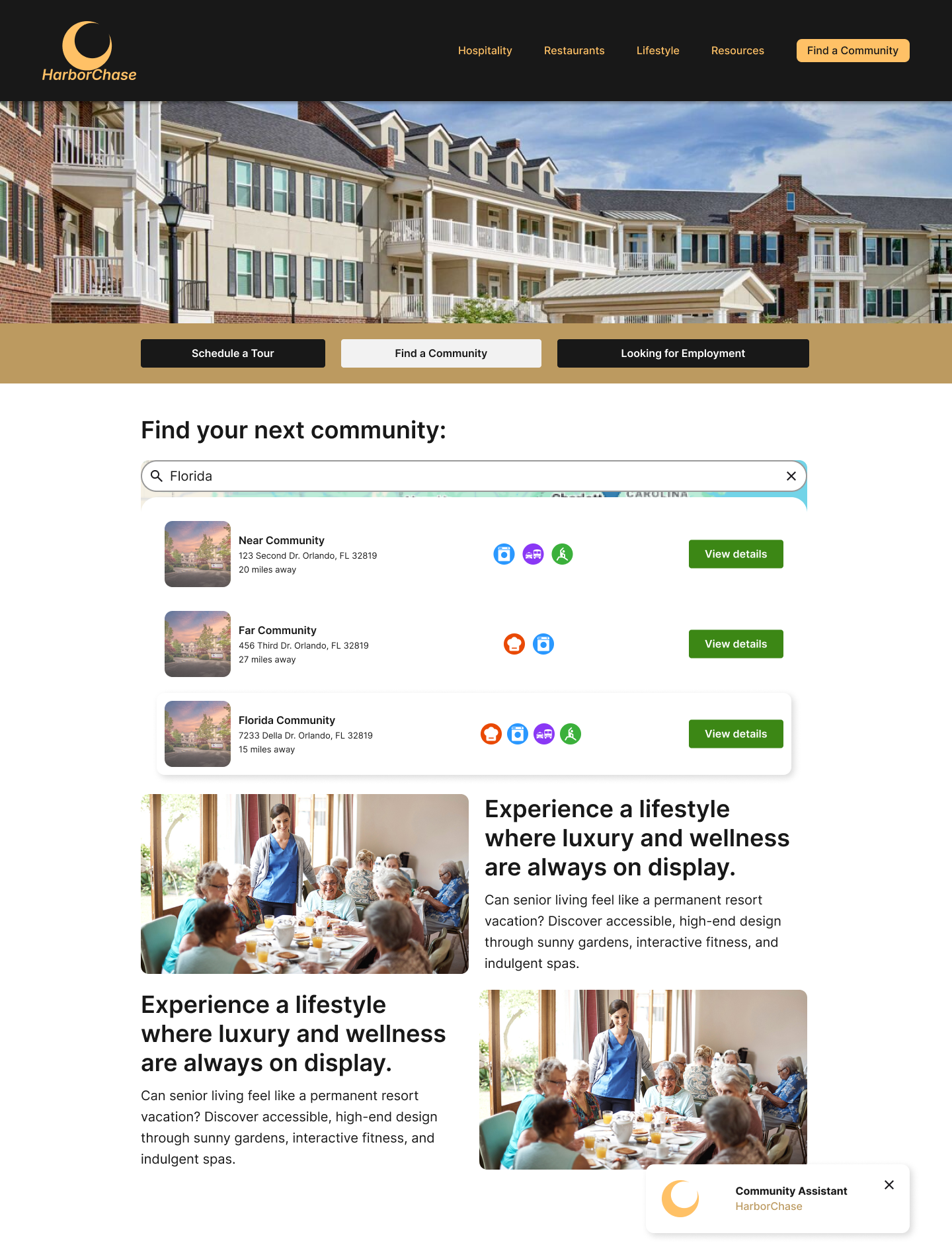
By adding predictive search patterns and visual confirmations, we eliminate the "no results found" frustration. Users see communities, care types, and locations in real-time.
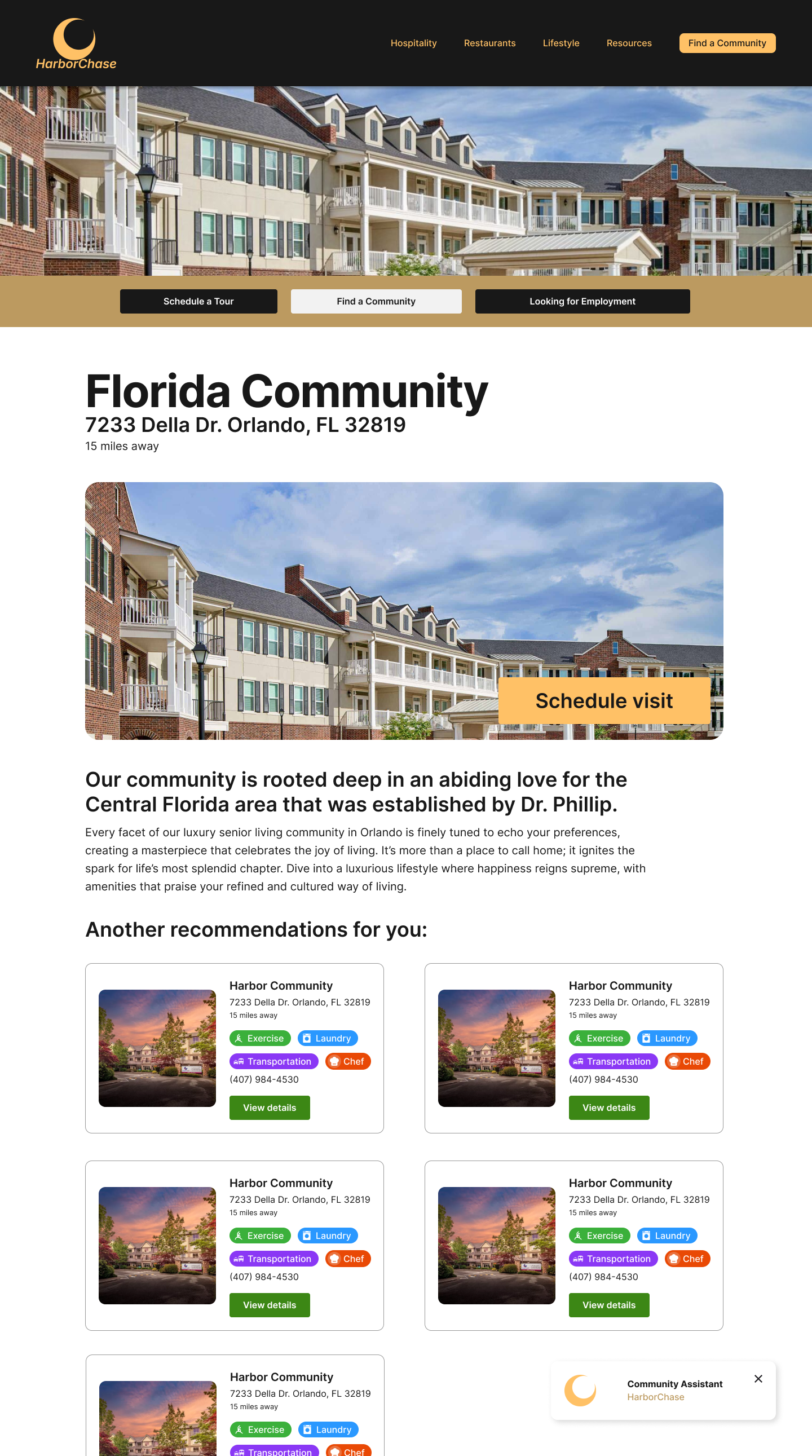
Every community card is designed to answer the user's top questions instantly: "Is it close?", "Does it have what I need?", "Can I see it?"
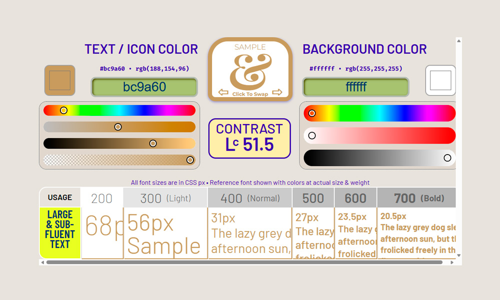
While the body text (#555555) has acceptable contrast, its font weight is not ideal for prolonged reading by an older audience. Additionally, the use of #bc9a60 on a white background yields an Lc of 51.5 under the APCA model, which is deficient for informational text. Proposal: Adjust font weights and darken golden tones on critical elements to ensure visual inclusion.
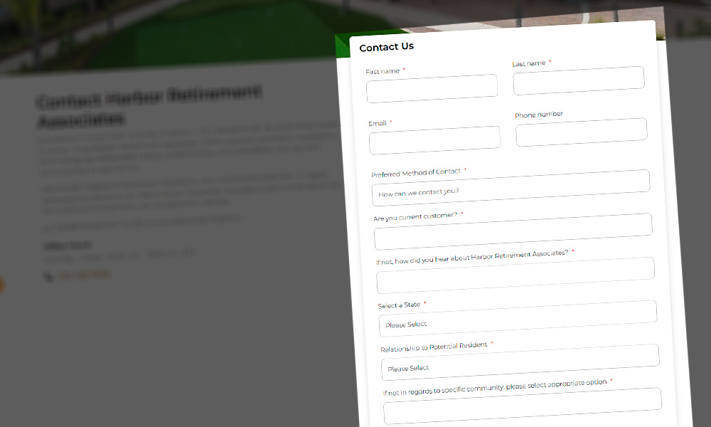
The current length of the contact form can lead to cognitive fatigue and abandonment. To maximize lead generation, I suggest transitioning to a segmented flow:
Business related Note:
"I understand these improvements represent a time and investment consideration. My approach would be to discuss these priorities with the Product Owner and the technical team to iterate in a way that provides immediate conversion impact without compromising delivery timelines."