UX Case Study
Mi Saldo:
Redesigning mobility in ZMG.
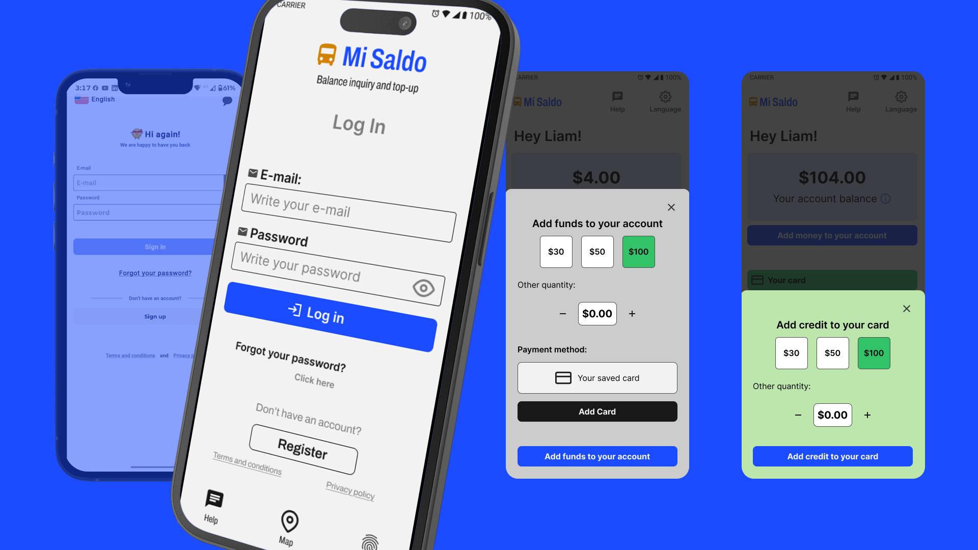
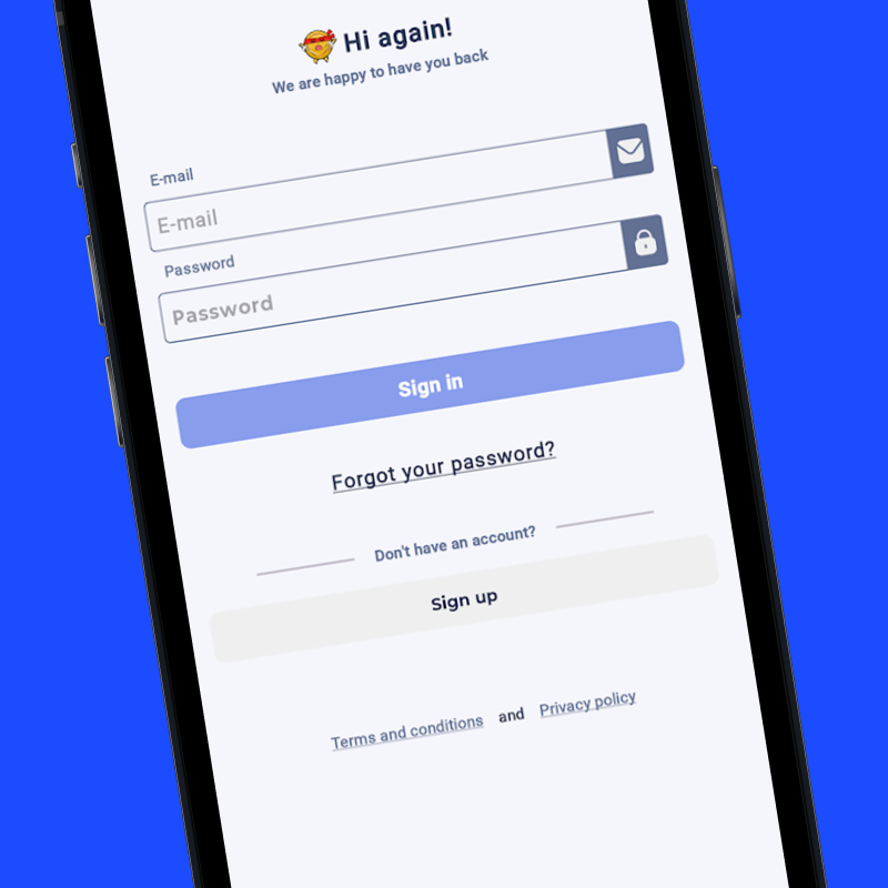
Eliminating friction in the NFC top-up and balance inquiry process.
Redesign proposal focused on accessibility and transactional clarity. Metrics are presented as estimated impact.
01. My Approach & Impact
Clarity in every transaction.
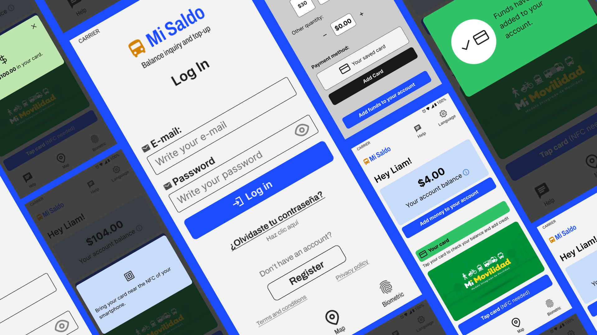
The goal was to eliminate visual ambiguity. By streamlining the top-up flow and unifying the visual language of balances, we achieved an error-free experience:
100%
Balance Certainty
-60%
Top-up Time
02. The Problem
Friction in Motion.
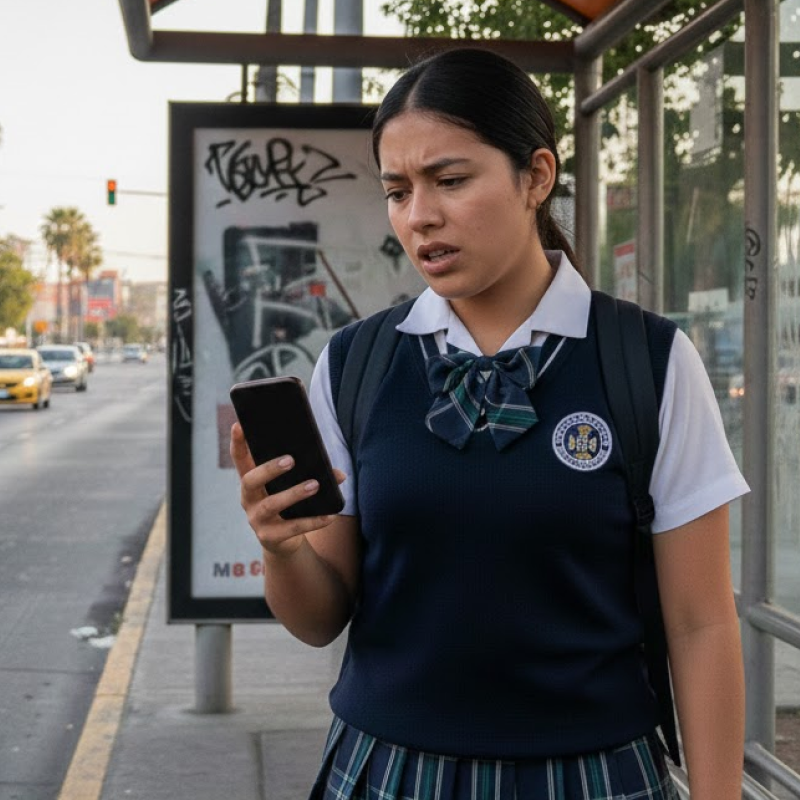
Andrea, 16
Daily Commuter Used to Tech
Sees the app as low-quality, unprofessional, and confusing due to ambiguous button labeling.
After redesign: Understands the app layout and flow clearly.
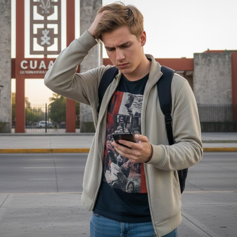
Liam, 22
Exchange student
Although he is familiar with the technology, he cannot find the function to change the language, while he thinks the app is confusing in general.
After redesign: Options location and layout are intuitive.
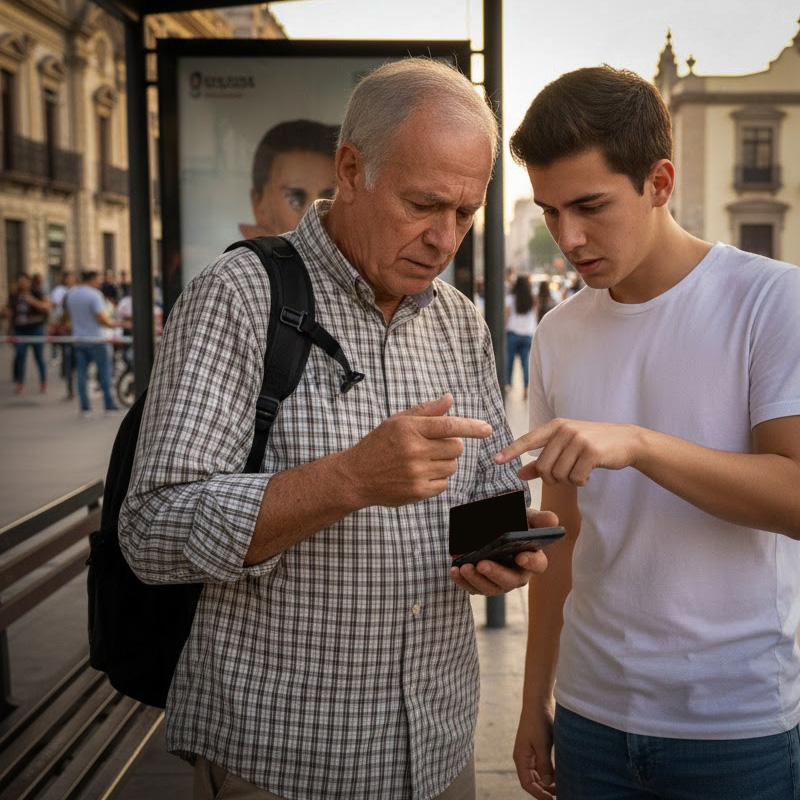
Ricardo, 68
Senior worker
Finds the process too complex, which leads him to depend on other people for assistance.
After redesign: Legibility is improved so it's easier for him to use the app.
03. La Solución
Transparent Architecture.
I reduced cognitive load through a linear 3-step top-up flow, eliminating unnecessary elements and prioritizing the primary action.
Clear balance differentiation: Using color and hierarchy to separate account vs. card information. The flow got an intuitive design, so users can easily add money to their account funds and then to their cards via NFC, just the way it is intended.
🚀 Zero Friction Results
Designed for real life.
By optimizing contrast and simplifying steps, we resolve user anxiety in public transit environments.
ACCESSIBILITY FIRST
Implementation of the APCA model to ensure balance amounts are readable under any street lighting conditions.
TRANSACTIONAL TRUST
Top-up flows validated in 3 seconds, reducing uncertainty and queues at stations.